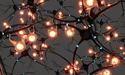
Infographics and similar visualizations might appear to be little more than eye-candy. They can be beautiful, easily digestible, memorable, but are they anything more than that?
Are they just a way to cater to our dwindling attention spans so we can scan information quickly rather than actually read it?
Or are they capable of much more?
As the movie Arrival demonstrates, visualizations can have a syntax—and superpowers—all their own.
Spoilers for the 2016 film ahead…
Arrival and the Power of Visual Syntax
The film Arrival, starring Amy Adams as linguist Dr. Louise Banks, is based on the novella “Story of Your Life” by Ted Chiang. The story documents Dr. Banks’ efforts to communicate with an enigmatic race of seven-armed aliens, aptly dubbed heptapods. Learning the heptapod language has a profound and unexpected effect on Lousie.
Along the way, the story demonstrates the unique superpowers of visual communication.
After unsuccessful attempts to communicate verbally, Dr. Banks prompts the aliens to share their written language. They produce inky, circular patterns that provide the clues she needs to crack the alien language and, indeed, their whole way of thinking. (You can read the fascinating story of the production design for the heptapod language on WIRED and Engadget.)
As Chiang puts it in the novella, the heptapod written language is based on a “visual syntax that’s unrelated to the syntax of their spoken language.”
What happens when you no longer constrain a written language to follow the syntax of a spoken language?
Sequential Awareness vs. Simultaneous Awareness
Spoken languages are built on what Chiang calls a “sequential mode of awareness.” In other words, speech requires that one word follow another sequentially.
Think about listening to a podcast. You can only hear a tiny slice of it at a time. It’s a strictly sequential experience.
On the other hand you can see a representation of the entire waveform of a podcast simultaneously. In theory—if your brain could decode that waveform into meaningful information—you could absorb the entire episode (or at least large chunks of it) at a glance.
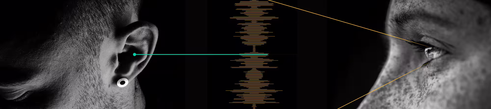
Even a transcript of a podcast mirrors the spoken language. We can scan the transcript more quickly than we can listen to the audio, but the written words ultimately have the same sequential syntax. Sentences are essentially one-dimensional constructs, like strips of ticker-tape gradually revealing and building a thought.
But not so with the heptapod’s written language. They don’t perceive time as linear or sequential. They have a “simultaneous mode of awareness.” Their circular written language is the perfect medium to express ideas with no beginning, middle, or end. It’s not about arranging words into sentences, it’s about conveying a complete thought at a glance.
Infographics and similar visual media have this same superpower. They tap into our capacity for simultaneous awareness. This means that visual media is uniquely suited to conveying information in ways the written or spoken word cannot.
And this superpower is specific to static visuals rather than videos or animations. Like listening to audio, watching a video is a strictly sequential experience. Have you ever impatiently tapped on a video to see how much longer it will last? We do that because we instinctively realize that the sequential nature of video content constrains the amount of information we can absorb. Static visuals have the potential to transcend that limitation.
Let’s review 3 examples that demonstrate this superpower in action:
Infinite Loops
Are you trying to describe something cyclical, a process that continues in an endless loop? A visual has the superpower to convey that.
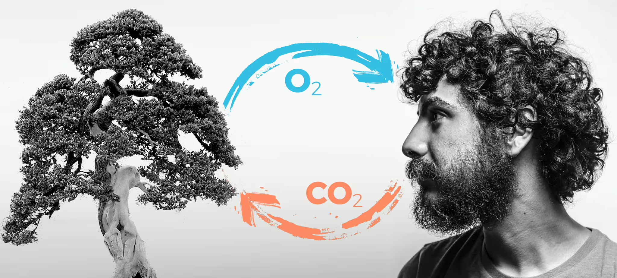
Consider the Oxygen-Carbon cycle. Or is it the Carbon-Oxygen cycle? When writing about the exchange of CO2 and O2 between plants and animals you have to pick a starting point, explain sequentially, then repeat.
With a visualization there is no beginning and no end. You perceive the concept simultaneously, just like a heptapod.
Complex, Nonlinear Systems
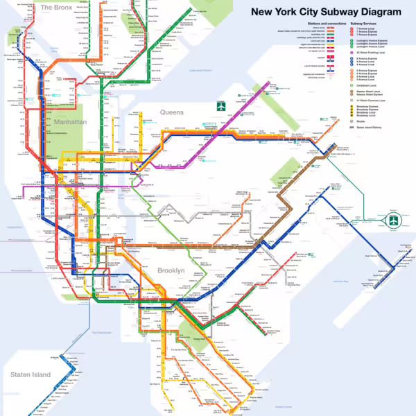
Are you trying to explain something that is complex and nonlinear? A visual has the superpower to convey that.
Consider a map of the New York City subway. Imagine trying to describe that network in prose. A visual lets you simultaneously perceive the entire network and focus your attention on the part that is relevant.
Transcending Time
Ordinarily we perceive time sequentially. We are like the passengers on a subway train seeing tiny slices pass by the window.
But a timeline or line graph elevates us “above” time, removing us from the confines of the subway train and showing us the whole map of time at once.
An iconic example of this superpower in action is this map by French civil engineer, Charles Joseph Minard.
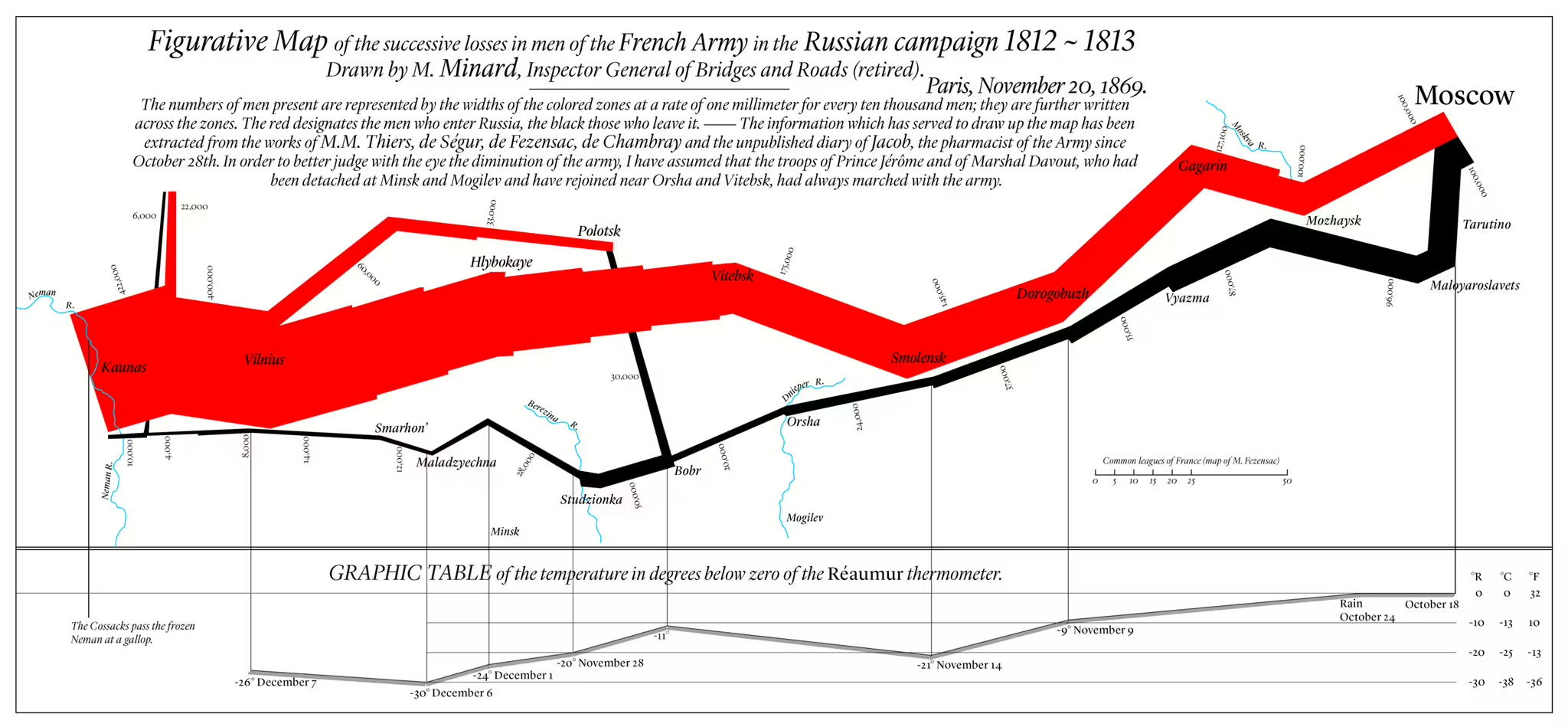
The original map was created in 1861 and depicts Napoleon’s Russian campaign of 1812 and 1813. The red line conveys the advance of the French troops on Moscow, the black line conveys the retreat. The width of the line represents the number of troops at any given point of the campaign. (Incredibly he also managed to include information about dates and temperatures.)
A written description or even an animation would have to dole out those details sequentially. We have to buffer each bit of data in our memory and make the comparison mentally.
On the other hand, once we understand the visual syntax of the map we find ourselves like heptapods—outside of time and perceiving the entire campaign simultaneously. We see not only location and direction of travel but also the catastrophic loss of life from beginning to end as Napoleon’s troops dwindled away.
The Takeaway
Visuals are potentially robust and powerful content with the superpowers to convey information in ways the spoken and written word cannot by…
- Removing the constraints of a beginning and an end, making them the ideal medium for communicating cyclical information.
- Allowing us to grasp complex systems at a glance.
- Reshaping our perception of time from sequential to simultaneous.
So when crafting your content strategy, consider if an infographic or visualization might be more than just a nice-to-have. It could be an essential way to convey your message clearly.
Looking for ways to help your audience visualize your message? Get in touch with Carney and our talented team of heptapods. We will help you design something out of this world.