Your Homepage Header, Hero, and Headline Audit

Audit time! Yep, we’re auditing websites today. Unlike an IRS audit, this one has a much lower risk of jail time and it’ll actually be helpful. So head over to your own website and follow along.
Let’s start with your homepage, the most important question you have to ask yourself is, “Does my homepage make a powerful first impression?” Don’t focus on anything except what’s above the fold for right now (meaning all the stuff you can see without scrolling).
Your goal at this point is simple: get people to stick and click around your website. So what can you show above the fold that prompts that action? There are about a gazillion answers to this, but generally, you should have:
- A simple headline that clearly explains your business
- Something that conveys the usefulness of your product/website
- A CTA that inspires them to take action.
So how about some examples? Here are a few headlines and the websites they come from that fit all three:
- Freshbooks. Their headline is crystal clear: “Small Business Accounting Software That Makes Billing Painless”. Under that, they also have a subheading that makes an emotional appeal, and then a CTA to Get Started on their platform.
- Act-On. “Marketing Automation for Fast-Growing Businesses”. Dang, that is so clear. You don’t even need to go to their website to figure out what they do. They also have a great subheading and a CTA to “See it in Action”.
- Beardbrand. They take a different, but equally compelling tactic with their homepage hero image. They serve up a quiz as the first thing you see on their website with the language, “What Type of Beardsman Are You?” None of us Carnage writers even have beards, but we all want to take that quiz.
- Kutoa leads with the headline “Buy a Bar. Feed a Child.” Then a CTA to shop now. Literally can’t be any clearer than that.
So maybe your business is a little more complex than these examples, but there are still a ton of other examples in this blog post.
Lead Magnet Ideas – Examples From Hubspot, Campaign Monitor, Pipedrive & More

“Lead magnets are like hypnosis applied to lead generation.” Dang, the opening sentence of this blog post is too true. Convincing visitors to give away their email addresses? Sometimes it’s downright magic.
Lead mags come in several varieties: Bars, Popups, and Landing Pages. All with the goal of getting site visitors to sign up to your list.
In an email world, lead magnets Rule. They convert really, really well. Take this example from SEO superstar Brian Dean. Using a lead magnet, he was able to increase the subscription rate of one of his pages from 0.54% to 4.82% overnight.
Okay, we get it, they’re powerful little pieces to your lead gen puzzle. Not sure which type of lead magnet is best for your brand? This article will show you how to uncover what your visitors want from you, thereby helping you find ideas for quality lead magnets. Consider these 3 golden rules of lead magnets that convert:
- Relevant: If the resource doesn’t look interesting, why would a user bother subscribing?
- Exclusive: It makes no sense to sign up if the visitor can get the reward somewhere else without giving away her contact details.
- Instantaneously useful: The lead magnet must help your visitors solve a problem they’re having right now (otherwise they will forget it).
Once you know what your visitors want, you can identify what kind of lead magnet will speak to them. As a marketer, you must identify a unique asset that you can give away fo’ free. Most companies have 3 main types of assets they can rely on:
- Unique data
- Unique expertise
- Existing customers
The following blog post shows you how to leverage your expertise, your data, and your customers.
You know what else is inside? Nine super-effective lead magnets examples (from incredible companies) that might just inspire your own. Get attractin’ y’all →
Just a Small Town Guy

Half the fun of playing the lottery is imagining what you would do with the winnings. Jordyn, for example, would buy an aviary to live in (don’t actually know if this is true or not, but it seems likely and she isn’t here right now to dispute this claim. Sorrynotsorry.).
Anyway, imagining your winnings is what the New York Lottery’s new ad campaign is all about.
In this particular ad, the opening shots show an empty town, empty streets, no one around. Lights in the buildings are on, but there is no movement. Eerie music plays in the background. It actually feels like the opening to a horror movie.
All of a sudden, a giant hand swoops into view and *spoiler alert* places a train on a train track…
We’re gonna leave you with a major cliff-hanger here.
“Create content that teaches. You can’t give up. You need to be consistently awesome.”
Neil Patel
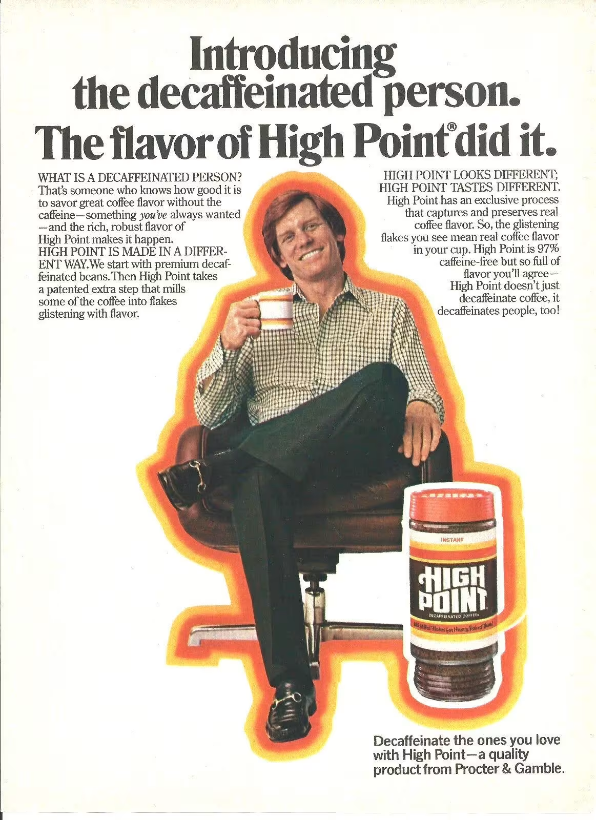
Ads from the Past


