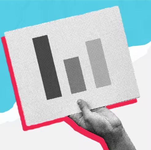
The Daily Carnage

The savvy marketer's hub for industry news, insights, resources, and culture.

Issues

View All

Everything Marketers Need to Know About the Apple WWDC22

JUNE 13, 2022

Last week, Apple held its 2022 Worldwide Developers Conference (WWDC22). While it had a lot of really cool product and software announcements, it also had some updates that marketers should have on their radar. Here are some highlights we think marketers need to know:

  • Consumer privacy protection: Apple offered an overview of the company’s “privacy pillars” that seek to minimize the data that apps need to function and to offer greater transparency into how apps use data. New features will help ad networks and advertisers measure performance while still promising to preserve privacy.
  • SKAdNetwork updates: The next version of Apple’s attribution solution, SKAdNetwork, is here. You can collect multiple event data continuously and understand hierarchal conversion values better.
  • Ad breaks in SharePlay: There are updates on how customers will see ad breaks when streaming in SharePlay, the co-viewing feature in its FaceTime video calling platform that is coming to iMessage with iOS 16.
  • App Store Connect: For all the app developers out there, there are new performance benchmarks!
  • Using your iPhone as a webcam: Native webcams on Macs are not nearly as impressive as phone cameras nowadays. This isn’t exactly marketing related, but it is for everyone working remotely that is looking for better video quality.

Get the other product and feature updates directly from Apple’s recap.

Breadcrumb SEO Best Practices for a Mobile-First Strategy

JUNE 12, 2022

Mobile-first experiences are great. But oftentimes, some SEO tactics are forgotten. We’re gonna break down breadcrumb navigations. They are often missing from mobile sites, so here’s how to use breadcrumb trails and their SEO benefits.

What are breadcrumbs?

We’re not talking about crunchy, delicious panko breading. Breadcrumb navigations are a line of links that indicate where the user is on a website and can act as a secondary navigation. They often look something like this: Home > Some Page > A Related Page > The Page You’re On.

3 main types of breadcrumb navigation trails:

  • Path-based breadcrumbs
  • Attribute-based breadcrumbs
  • Hierarchy-based breadcrumbs (Ding, ding, ding! The best option for SEO.)

Benefits of breadcrumbs:

  • More crawling – The internal links generated by the breadcrumbs help to expose all levels of the hierarchy to search engine crawlers.
  • Better indexing – Hierarchical links help Google to contextualize content and correctly associate pages in the site structure.
  • Higher ranking – Just as with crawling, breadcrumbs support ranking because of the internal linking. This can lead to more SERP clicks as well.

Breadcrumb best practices for UX:

  • Consistently available: Breadcrumbs should be present on every relevant page that you would want wayfinding value on.
  • Logical location: Position breadcrumbs directly underneath the primary navigation menu and above the H1. It’s where users expect it and boosts the internal linking power for your SEO.
  • Clear start and end of hierarchy: Breadcrumbs should show the journey from the homepage to the current page a user is viewing.
  • Sized just right: Keep the breadcrumb design simple and use a smaller font that the other navigation and header items on your site.
  • For mobile: This likely isn’t going to match the desktop design and won’t always work as a single line or links without scrolling and anchor options. Just be sure to keep it as concise as possible.

Check out the full article of breadcrumb tips by Search Engine Land!

4 Information Architecture Trends to Know

JUNE 7, 2022

Apps, sites, even the metaverse, are digital products and systems that can fall apart without user-friendly navigation. One of the biggest starts to a strong user interface and user experience design is the information architecture (IA).

IA use cases have changed a little bit with new tech. Here are some current trend (and a few predictions) for IA that marketers and designers should know before they tackle a new digital product.

  1. Remote Collaboration: Creating IA should not live in a bubble. Trends in IA tools include more robust software with multiple-user feedback options are the new norm.
  2. AI Optimized IA: We’re going to see a big influx of “chicken before egg” data scenarios as machine learning continues to grow. We can make educated decisions when making an IA, but might need the precision of data where artificial intelligence give IA a boost. On the other hand, your data is only as good as it is organized. So that AI is gonna need data architecture of its own.
  3. Metaverse Navigation: We get that not every brand is metaverse ready (yet), but there’s a possibility that we will be using it as the primary experience for marketing and shopping. Designing IA for AR/VR involves spatial thinking and location-based data.
  4. Zero UI: The future of interfaces is…there are none. The metaverse is a digital transformation in itself, but what if you just continue to remove barriers of traditional navigation? Instead of IA using technical navigation, we may be continuing to use more toward “natural” methods like speech, touch gestures, and glances. That means creating IA that plays by a different set of rules that don’t always include screens.

Check out Slickplan’s full post for more IA trends and practices happening now.

The 4 Ps of Marketing (and How to Use Them)

JUNE 6, 2022

Throughout your marketing career, you may have heard of the “4 Ps of Marketing” before. They are:

Product, Price, Place, + Promotion

The idea is to use the Ps as a way to design marketing plans to fit the dynamic social timing and target market. It very much follows the “right place, right time idea.” Since it’s been around since the 1960s, that idea hasn’t changed too much. Now we just have a lot more control as marketers on the timing and placement.

The 4 Ps form a dynamic relationship with each part being equally important in crafting a strategic marketing plan.

  • Product – The product is the good or service being marketed to the target audience. Consider your target audience and their unique needs.
  • Price – Price (duh) is the cost of a product or service. Pick a price that is simultaneously accessible to the target market and meets a business’s goals. Research what competitors charge and what your target audience wants to pay.
  • Place – Place has to do with your distribution channels. Finding the right place to market and sell your product all relies on your target audience.
  • Promotion – Promotion is how you advertise your product or service. This is where timing and methods come to play.

Other Marketing Mixes to Consider:

  • The 5 Ps – Product, price, place, promotion, + people. So now there’s an added focus on customer behavior and experience.
  • The 7 Ps – Product, price, place, promotion, people, processes, + physical evidence. This is another variation with customers added to the mix but also with a retail experience focus.
  • The 5 CsCustomer, company, competition, collaborators, + climate. This has an emphasis on external factors, such as possible outside collaborations and competitive research.

Wanna learn more about making marketing plans based on audiences and timing, check out the full post on Coursera (and maybe even take a few courses).

The Key Differences of Landing Pages vs Websites

JUNE 5, 2022

We’re not joking when we say we want to make sure you’re the sharpest marketer in the room when you read The Daily Carnage. So today we’re going to help you out with a little game of “Spot the Difference” between landing pages and websites.

Let’s Start with the Basics:

A website is a visitor’s chance to get to know the details of your brand, making it general to brand awareness and for building trust.

Landing pages are stand-alone web pages used in a way that is specific to a stage of the customer journey.

So while you could say a landing page is just a type of web page, it serves a bigger purpose in function than your average site.

Types of Landing Pages:

  • Squeeze Pages – These are used purely for email opt-in collection using an incentive.
  • Splash Pages – A splash page is an introductory screen a user sees when visiting a website with campaign-specific information or offers.
  • Lead Capture Pages – Similar to a squeeze page, these guys are straightforward about collecting more information after interest has been shown from a user.
  • Long-Form Pages – These are landing pages that are created with more specific product information to convince a sale.
  • Click-Through Pages – Instead of having a form listed first, a user clicks a CTA to move on to a click-through page that would request information.
  • Thank-You Landing Pages – After a user has made a purchase or action, give them a subscription option.
  • Coming-Soon Pages – Grab contacts before a launch so you can announce it to a primed audience.

So now you’ll never mislabel a landing page. Check out the full article by PageFly for some stellar landing page tips. PageFly is a Shopify product and they focus a lot on eCommerce marketing, but it still applies to anyone in the game of capturing leads.

7 Tips to Keep Your Website Secure

JUNE 1, 2022

Yikes. We’ve seen some hefty data breaches and site hacks in our years. Is anyone really safe?

The digital world is always changing and developers and marketers have to stay on their toes when it comes to making secure app and website choices. Here are the latest things you can do to make sure your websites are secure.

  1. Install SSL – A Secure Sockets Layer (SSL) certificate encrypts information passing between your website and your visitors. Some browsers deter users from sites without SSL. You can get an SSL from your CMS, a third-party vendor, or even install one yourself.
  2. Use anti-malware software – There are a lot of options out there that can scan and prevent malicious attacks.
  3. Make your passwords uncrackable – But you don’t just need one good password, you need solid and different passwords across your accounts.
  4. Keep your website up to date – Even if you had a solid security stack on launch…it might be out of date in a year (or sooner). Keep an eye on your core updates, plug-ins, and licenses. Not all of these are going to have obvious alarms when they go out of date so you may have to set yourself reminders.
  5. Watch out for hackers elsewhere – Email is still the number one method for malware to be delivered. You have to be wary of email scams, unsecured internet, and any access you give others to your accounts.
  6. Manually accept on-site comments – Bots, fake accounts, and trolls are ready and waiting with unsavory links. If you create a moderation process, you won’t have to worry about your site’s users.
  7. Run regular backups – Just like keeping up to date on all things in your tech stack, you also have to keep a copy of your site. After all, website mistakes and breaches are often because of human error.

Wanna get more security tips? Website Builder Expert is the blog with all the answers.

3 Best Practices for ADA Compliant Websites

MAY 31, 2022

Following ADA compliance for websites ensures your users can easily access your site and have good experiences regardless of ability.

An ADA-compliant website adheres to the Title III accessibility requirements of the civil rights law by making accommodations for individuals with disabilities. The Web Content Accessibility Guidelines (WCAG), developed through the World Wide Web Consortium (W3C), provide a single shared standard to make web content more accessible for people with disabilities.

While achieving full accessibility takes time and effort, there are several website accessibility practices you can check on your site now.

ADA Best Practices

  1. Add alternative text: Use alt text within your HTML code to give meaningful descriptions of your web images’ function and appearance. You can typically add alt text through your Content Management System. Alt text allows people using screen readers to understand your web images’ context better. Bonus, it can also improve your SEO since alt text for your images provides context to search engine crawls.
  2. Provide keyboard navigation: Ensure users can navigate your entire website using the tab key and other keyboard functions, rather than a tactile mouse or touchpad. Designing with keyboard navigation in mind ensures your IA, headings, menus, and other web elements are organized in a way that all users benefit from.
  3. Use accessible colors: Ensure all your content’s colors adhere to the WCAG’s contrast ratio requirement for the visual presentation of text (especially text on images). It should be at least a 4.5:1 contrast ratio to be accessible and ADA compliant. Need a tool to check that? Try this Contrast Checker.

Check out more ADA tips and resources from Motley Fool’s article.

Choosing Between Gated vs. Ungated Content

MAY 30, 2022

Gated content requires a user to enter their personal information to access or download it. But that means it has to be good stuff for someone to fork over their info. It can be things like original research, exclusive data, or guides.

When should you put up gates around content? When should you not?

Pros of Gated Content

  • Ups a piece of content’s value.
  • Gathers user information to then track conversions and measure analytics.
  • Helps segment an audience based on interest or to serve different content.
  • Helps qualify a lead.

Cons of Gated Content

  • Deters some people from a site because they don’t want to enter their information.
  • People can share files with others, leading to untrackable leads.

4 Questions to Help Determine Whether to Gate Content or Not

  • How do you build trust with your audience? – Gated content is something that people will sign up for if they trust the source. Keep this in mind for people who are new to your brand.
  • What goals are you trying to meet? – Gated content should have a purpose to your journey and lead nurturing.
  • Is your content worth a gate? – As we said, people don’t give their info up for just anything. Your content has to be valuable enough for a user to want to grab it.
  • Can you do both? – Try a hybrid approach by previewing the most interesting parts of it then request user information for the full thing.

Check out the full post by Springboard for more ideas on using gated content.

16 Content Creation Tools to Know

MAY 25, 2022

We cover a lot of tips and tools for your workflows and inspiration. You may have heard of a lot of these, or you may have missed them in past issues. BuzzSumo put together a list of content marketing essentials, and we wanted to share some of our favorites.

  1. Exploding Topics: Trend finding can seem daunting, but they all start somewhere. Exploding Topics is a content inspo source for emerging trends across all sorts of industries.
  2. Answer the Public: Google loves to support content that answers questions. Answer the Public scrapes autocomplete search data from Google so you know what Qs are being asked in the first place.
  3. Hemingway: This app not only checks spelling and grammar, but points out where your sentences could be more concise or places to use a more active voice.
  4. Headline Analyzer: Get it right from your first impression. CoSchedule’s Headline Analyzer helps you craft eye-catching headlines.
  5. Flourish: Data is beautiful. Flourish helps you make it even more visually appealing with unique, interactive, animated charts and visualizers. They can even make them mobile-friendly
  6. Video Peel: We’re always saying how powerful social proof is for content. Video Peel helps you create user generated content with easy automation on review requests and video creation for your users.

Check out all 16 tools curated by BuzzSumo to get cracking on your content creation and proofing processes.

Insights

View All

Get the best daily marketing newsletter in your inbox