Be in the Know
- Macy’s is bringing Toys ‘R Us back with store-in-stores in 2022 for US locations
- Aerie’s #AerieReal campaign features a wider variety of voices including artists, The Rollettes wheelchair dance team, and TikTok twins
- Adidas sells Reebok to Authentic Brands after holding the brand it for over a decade
- Zynga acquired Chartboost to combine forces on their mobile advertising platform and advertising partners
11 Principles of Design
There are a lot of elements that make a “good” design. We know, it can be kind of subjective, but there are still some basic truths to good UI, UX, and appealing visuals.
Dribble gave 11 design principles every designer and beholder should be familiar with. These are the 5 biggest ones according to The Daily Carnage:
- Hierarchy: This one is a touchy subject for designers. “Can you just make all the text a bigger font?” If we had a nickle every time that was asked…Your eyes need things to gravitate to and they can’t do that if all elements are treated the same. Visual hierarchy uses scale, color, different typefaces, sizes, and font weights to break out elements and create interest.
- Alignment: It’s in our nature to want things to align together. While there is a method to the madness at times, having text or design work together with alignment, patterns, or positioning is going to create the most visual appeal.
- Emphasis: This is all with the user in mind. And for some reason, this aspect of design often falls flat. Knowing where to draw to a CTA, image, or other element separates someone who can make things pretty from a UX beast.
- Negative Space: Give us some space! Some breathing room is great when it comes to designs, and more is more with this techiqnue. The more white/negative space, the more attention you’re putting on an element.
- Contrast: We love contrast with color, shapes, or similar properties of elements. A huge reason we love it is for accessibility. Contrast between elements, especially text on a background, is also essential for accessible design. It should never be an afterthought!
These were our favs but for the other six principles, check out the full Dribble blog post. Sometimes great design is meant to break “the rules” and sometimes its beautiful because it’s by the books. Either way, revisit this list and see what concepts you can use in your next project.
Q for You
So how many of you are on Yik Yak now?
Principle
Interactive and mobile app design done in a snap. Principle is a Mac app that makes your animated and interactive user interfaces seamless. It can handle motion and movement for projects big or small, you can look at individual assets, or multi-screen app interactions. Import your designs from Figma or Sketch with the option to import any changes as you go, making it great for teams sharing designs!
Scalemail Referrals
Throw your best supporters a bone!
Scalemail Referrals incentivizes your most loyal subscribers to spread the word about your newsletter or site. Offer up swag items, discounts, or gifts in exchange for referring new followers. We build it right into your existing system, making it easy for your current audience to share away.
Ask for a demo to see how Scalemail Referrals can help grow your list!
AAWWW

AA Insurance released a calm, cute commercial for their Ireland locations. It may just be used for some marketing meditation. We’ve said it before, you use the kittens, we watch the ad. It’s just law at this point. And honestly, don’t you want your insurance provider to be a comforting presence in potentially stressful situations? Their ad drives home that you can relax and they handle the rest.
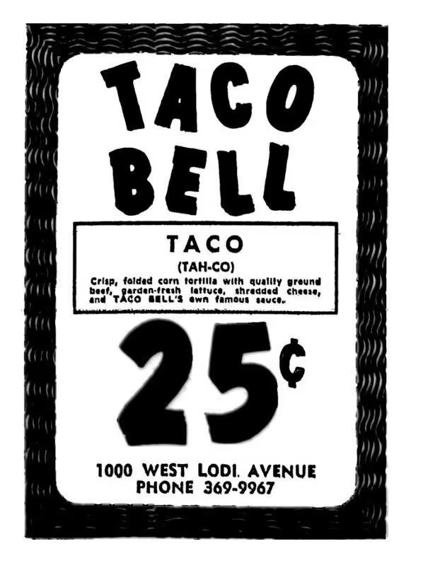
Ads from the Past

1970, Taco Bell
“In a very real way, designers create the human environment; they make the things we use, the places we live and work, our modes of communication and mobility. Simply put, design matters.”
William McDonough

