Should You Click the Audience Expansion Box in Facebook Ads?

We’re getting reeeealllllyyyy specific with today’s Listen. We’re only talking about one tiny little box on Facebook — the interest targeting expansion checkbox in Ads Manager.
You’ve probably seen this before when you’re building a new audience, it’s right under the detailed targeting section. It’s automatically “checked” when you’re building a new audience, but of course that raises the question: should you leave it checked or should you manually uncheck it?
Molly Pittman conducted an experiment to find out what you should actually do. She created two identical ads — the copy, creative, targeting, budget, etc. were all identical. The only difference was that one ad had the box checked and the other did not.
Guess. What. Happened? Turns out that checking the box actually made her ads perform worse. Here are the most important stats:
- Number of leads — Checked: 1,665 vs. Unchecked: 1,987
- Cost per lead — Checked: $3.24 vs. Unchecked: $2.58
- Unique clicks — Checked: 2,864 vs. Unchecked: 2,984
But perhaps the most damning evidence that checking the box isn’t worth it, is in their conversion rate on the landing page. In cases where they checked the box, their conversion rate was 58%. But, when they unchecked the box, their conversion rate was 66%. That’s a huge difference.
Daaaang Facebook, ice cold. And to think we trusted you!
Molly thinks the reason that checking the box made the ads perform worse is because she lost control of her audience targeting. Facebook automatically targets people similar to her audience when that box is checked, but Facebook doesn’t know everything.
Moral of the story? Uncheck the box.
Whatchu think? Join 10,000 other marketers and get this newsletter your inbox on the daily. Sign up riiiiiight here.
How Hard Is It to Draw a Brand Logo From Memory?
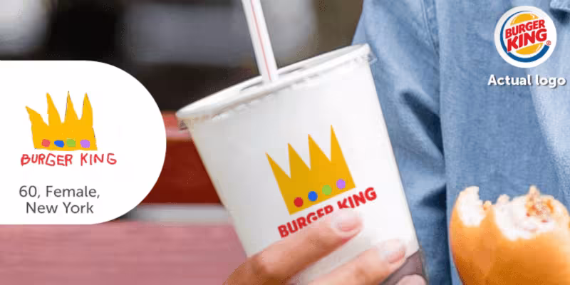
Quick! Draw the Starbucks logo from memory (without Googling it…we see you trying to cheat, Kyle). It’s harder than you’d think. What colors are used? Where does the word “Starbucks” go? Trick question: their brand name isn’t anywhere on the logo.
As Signs.com found out, drawing brand logos from memory is way harder than you’d expect. They asked 150 Americans to draw 10 famous logos from memory, and the results are…laughably bad.
With brand logos being some of the most prominent images these days, you’d expect people to have a good handle on what they look like. Out of all the logos, people were the best at drawing Ikea’s logo and the worst at drawing Starbucks. Weird considering how often we’re at a Starbucks versus Ikea. (Although, we get so lost in Ikea that we’ve probably spent more cumulative time in Ikea than Starbucks.)
Anyway, today’s Read might not make you a better marketer, but it’ll definitely give you a few laughs. Just wait until you get to the section where Signs.com mocked up the poorly drawn logos onto specific products.
Some of our favorites:
It’s Friday, you deserve a few lolz.
This Must Be the Place

Speaking of Ikea (and getting lost in Ikea), they just whipped up a suuuuuper helpful app that will likely save you days of wondering around in the store. And, it’s accompanied by a super cute ad, filled with progressive couples and a charming message.
Ikea Place, available now on iOS 11, is an augmented reality tool you can use to see what exactly a piece of furniture will look like in a room and, maybe even more importantly, how exactly it will fit. By snapping a photo of your space, Ikea Place will show the furniture of your choosing true-to-scale right where you want it, right on your phone.
The future is here, y’all. And it’s Swedish.
“We’re not the only narrator of our story. The content fans produce are also chapters.”
Kate McLaughlin
Ads from the Past