Be in the Know
- Kanye West and Balenciaga released merch for his “DONDA” album and it hints at a 2024 presidential running
- Do you fly with Delta? Spotify will take over the audio section of Delta’s in-flight entertainment
- Speaking of audio, General Mills’ Lucky Charms dropped an album and it’s cleverly titled “Magically Delicious”
- Pearl Milling Company releases its first ads under its new rebrand and calls it out, but manages to have only the tiniest mention of their previous Aunt Jemima name
The Website Accessibility Checklist
Not to toot our own horn (toot), but we know a thing or two about making accessibility a priority, not an afterthought, for websites. We get it! A lot goes into making a website beautiful and functional.
Web Content Accessibility Guidelines (WCAG) has a full checklist of 50 criteria. To help you out with some of the major conformance features of websites, here is a checklist:
- Back Away from Blinking: Flickering, flashing, or quickly alternating content can trigger seizures for people with epilepsy. If you are going to have shifting content, slow it down.
- Color Contrast: Sometimes people can only read the text if there’s a strong enough contrast between the text and the background colors (psst, check out today’s Tool to help with that).
- Alternative Text for Images: Screen readers help to relay what’s on a web page, but they can only use the information at hand. If your descriptive alt-text isn’t accurate, a screen reader is going to relay that.
- Caption Your Content: People who can’t hear won’t know what’s being said in a video unless it’s captioned or transcribed.
- Resizable Text: Most websites are all about trying to be responsive, but also keep resizable text in mind for people with low vision. Avoid a lot of images with overlaid text.
- Keyboard Navigation: Unique scrolling can be interactive, but not everyone is using a mouse or mobile device the same way. Arrow keys or assistive technology should also be able to navigate your site.
- Page Titles: Pages should have unique titles that are brief but descriptive for screen readers and SEO best practices. Two birds one stone!
Check out Essential Accessibility’s post for more details on website features that make your website accessible to those with disabilities.
Q for You
What are your thoughts on marketing with “blood” products?
Contrast Checker
Everyone says that colors, text, and backgrounds have to have strong contrast to make design and websites more accessible to the visually impaired. But how can you decide what has enough contrast? WebAIM (Web Accessibility in Mind) developed a color checker just for that! Simply input the color codes for the colors you want to use and see the contrast ratio they make. They also have the Web Content Accessibility Guidelines for your reference, so check out your ratios with this free tool.
Engaged?
Emails have text, images, and links that often take them out of a window or app. But you can make your newsletter more interactive by letting readers take action right within your emails with Scalemail Polls.
This polling system provides a way to engage with your readers in a fun and simple way. Reach out to us about getting Scalemail Polls into your newsletter.
You got a little something on your face…
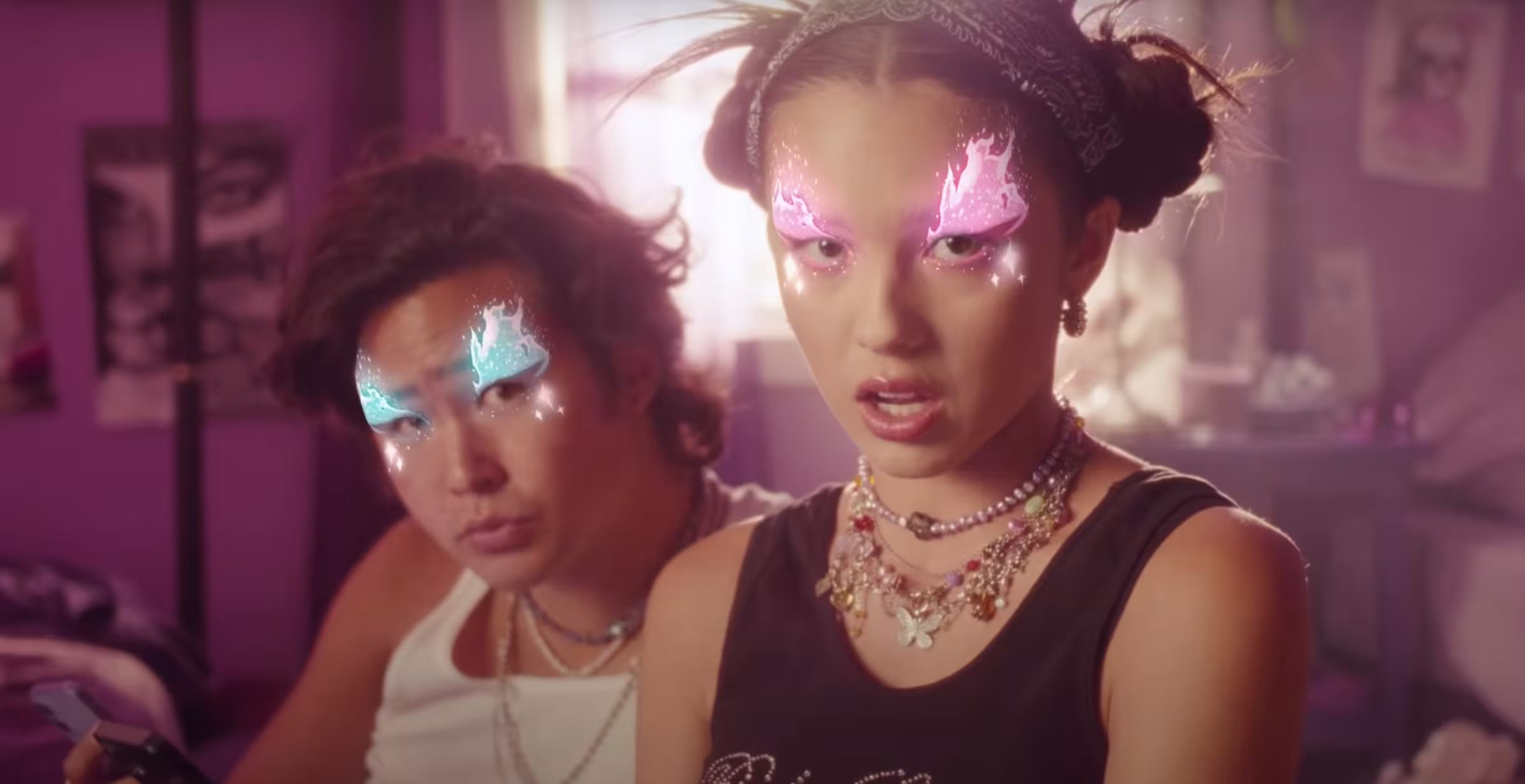
This Apple ad features the power of the iPad. Singer Olivia Rodrigo released a music video for her song “brutal” which has some funky faces with tears, flames, stickers, and some scary eyes. The ad shows “brutal masks” that were designed using the FacePaint feature on the Procreate app.
See the products in action and in use. Isn’t that what we all want from an ad?
Ads from the Past
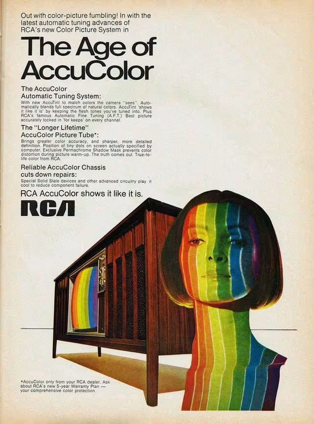
1970, RCA
“The power of the Web is in its universality. Access by everyone regardless of disability is an essential aspect.”
Tim Berners-Lee